Summary
Discover the fascinating world of 404 webpages – the unseen guardians of the internet. While their goal is to avoid being seen, their creative potential and strategic importance in enhancing user experience are explored in this insightful blog.
In the vast landscape of the internet, where information highways connect us to a world of knowledge and entertainment, there occasionally arises a perplexing phenomenon known as the “404 webpage.” This digital enigma has a mysterious allure, often lurking behind mistyped URLs or broken links. But what exactly is a 404 webpage, and why does it matter even if its primary goal is to remain unseen?
Unveiling the 404 Mystery
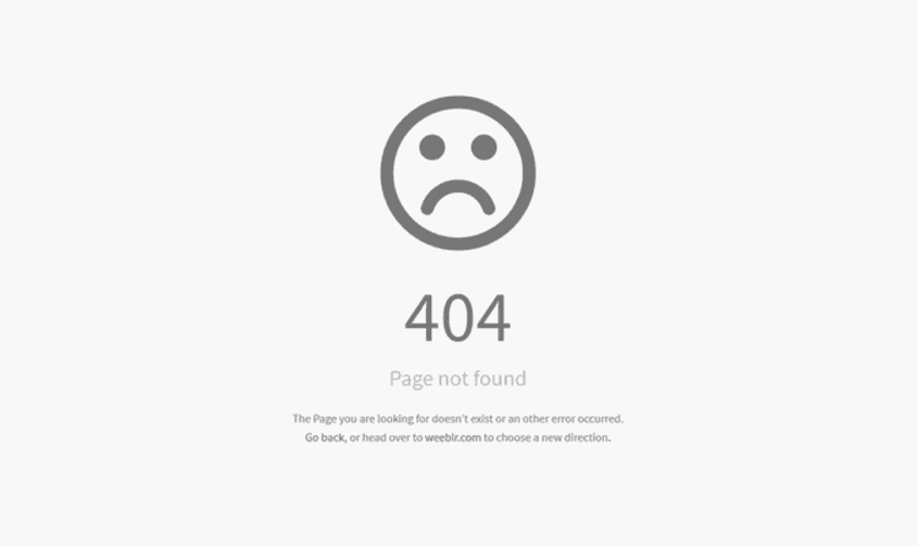
At its core, a 404 webpage is an error page that appears when a user attempts to access a web page that doesn’t exist or cannot be found on a website’s server. The “404” code is derived from the HTTP status code that servers send to a user’s browser to indicate that the requested page is not available. The outcome? A visually unappealing, plain page that usually includes a concise message informing the user that the page they’re seeking couldn’t be found.
The Hidden Importance of the Unseen
The irony lies in the fact that the ultimate goal of a well-functioning website is to keep users far away from the dreaded 404 page. After all, encountering a 404 error is synonymous with a disrupted user journey – a digital roadblock that hinders smooth navigation. Ideally, users should be seamlessly directed to the content they’re seeking, without any hiccups along the way.
However, the value of a 404 page extends beyond its role as an error message. It’s a silent sentinel, standing guard over the digital realm. Imagine a city planner who not only designs the streets for optimal flow but also accounts for the occasional detour or construction zone. A 404 page is like that, a guardian angel ensuring that even when things go awry, users don’t get lost in the labyrinth of cyberspace.
From Frustration to Fun: The Creative 404
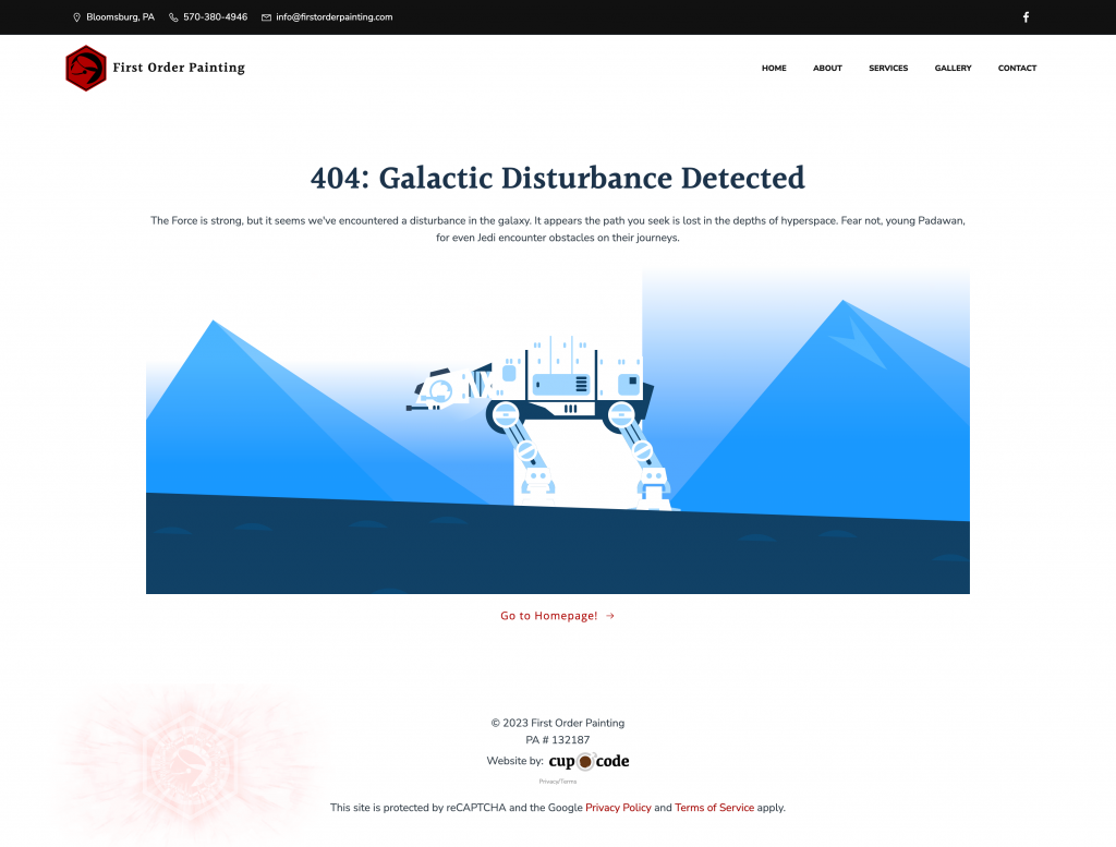
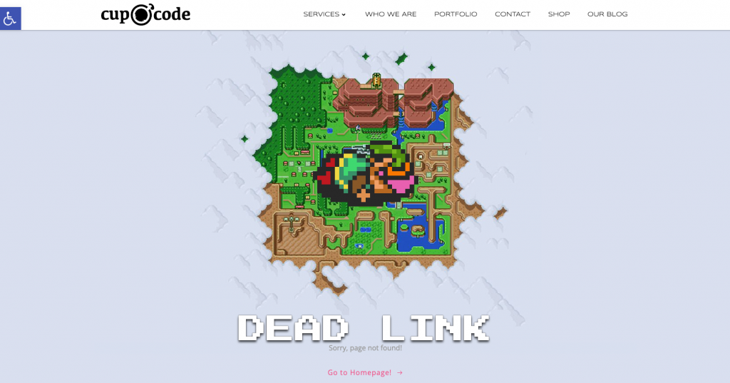
While encountering a 404 error might initially elicit a groan of frustration, it’s also an opportunity for websites to inject some personality and creativity into an otherwise mundane situation. A cleverly designed and thoughtfully executed 404 page can turn a potential negative experience into a moment of delight.
Imagine stumbling upon a page featuring a quirky animation of a lost astronaut floating through space, a mischievous cat playing with a cursor, or a clever pun accompanied by a cute illustration. These moments of unexpected amusement not only diffuse frustration but also showcase a website’s dedication to user experience. They transform a potential annoyance into a chance to connect with users on a more personal level.
Turning Detours into Destinations
The 404 page’s potential extends beyond mere amusement. It can be a strategic tool to retain users and guide them back to their intended destination. By including a search bar, a list of popular pages, or direct links to relevant sections, websites can convert a lost user into an engaged visitor. This redirection not only minimizes the negative impact of encountering a 404 error but also maximizes the chances of retaining a user’s interest.


Conclusion: Navigating with Finesse
In the intricate tapestry of the internet, the 404 webpage is a stitch that often goes unnoticed but holds the fabric together. While its primary purpose is to remain unseen, its influence on user experience is profound. The act of turning a potentially exasperating moment into a delightful encounter demonstrates a website’s commitment to providing a seamless journey for its users. So, the next time you find yourself astray in the digital realm, don’t be surprised if a whimsical 404 page gently nudges you back on the right path.


